Yoru
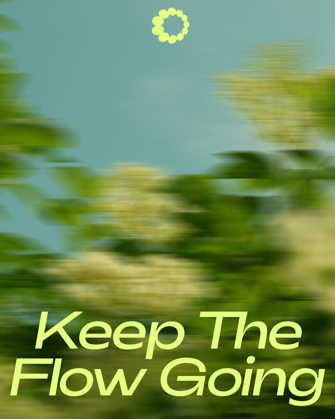
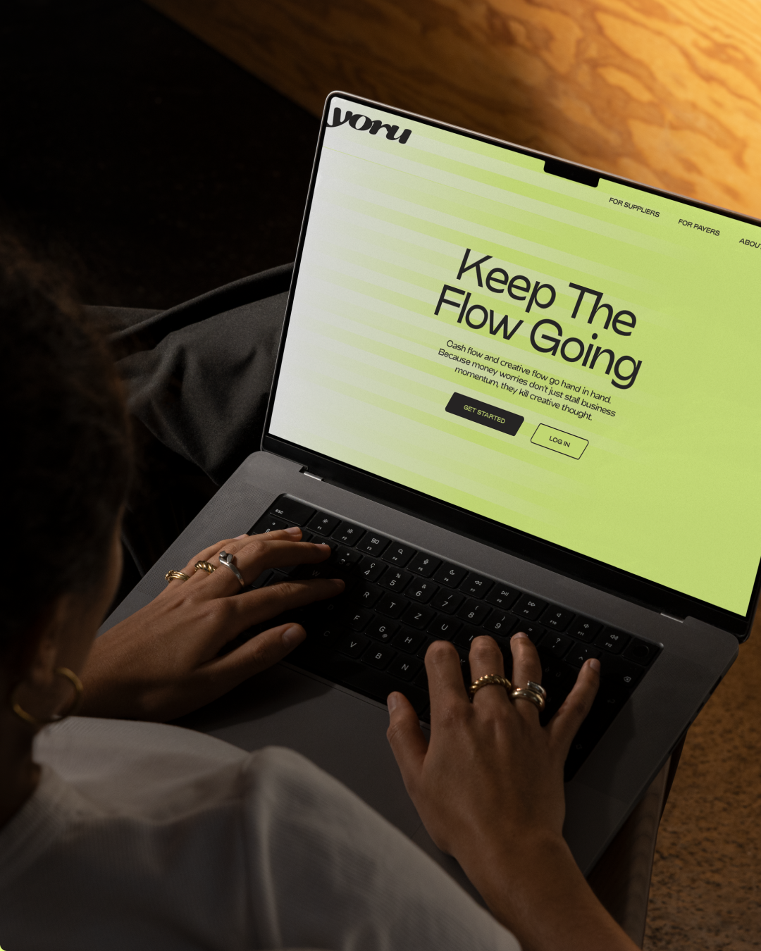
Keep The Flow Going
Connecting the disparate worlds of finance & creativity
Strategy: Positioning & brand platform by Bare Bones
Identity: Developed in collaboration with Rosie Pearmain @ Studio Rosa
The Challenge
It’s a sad truth that of the millions of businesses started every year, only half make it past 5 years. And of those that don’t, 85% of failures are due to poor cash flow.
One industry that particularly struggles when it comes to cash flow is Creative.
Long payment terms, unpredictable income and upfront delivery costs mean many founders are forced into difficult trade-offs: turning down exciting work, taking on the wrong projects, funding the business personally, or giving away precious equity just to stay afloat.
Invoice Factoring start up, Yoru, was created to tackle this problem.
A fintech designed specifically to help creatives who, by their own admission, are not typically ‘business-y’ kinds of people and need simple, intuitive finance tools that empower them to focus on the making.
The trouble was, from its blue colour palette, to its jargon-heavy language, everything about Yoru’s brand was screaming traditional finance.
If they were going to stand out in a sea of fintech sameness and genuinely offer something different, they needed a positioning and identity to match.
The Simple Strategy
The opportunity was not just to rebrand Yoru, but to make the offer easier to understand and more meaningful to the people who needed it most.
The first challenge was functional.
Most people outside finance have no idea what “invoice factoring” means.
So we reframed the offer in simpler, more useful language:
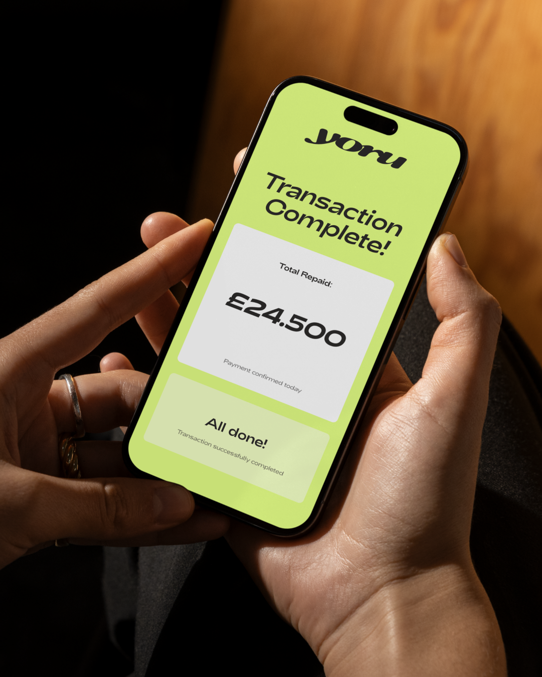
Yoru is a Payment Accelerator.
That shift did two things at once. It made the product immediately clearer, while also helping move the category away from outdated financial language into something more modern, dynamic and accessible.
The second challenge was emotional.
Creativity and finance are not typically two worlds that go hand in hand. So we needed to find a way to connect the dots and make Yoru meaningfully resonate with creative businesses.
The big unlock came when we landed on the idea of flow.
Because the truth is poor cash flow doesn’t just stall business momentum, it kills creative flow.
In conversations with customers and other creative founders, one theme kept coming up: it is almost impossible to do your best work when your head is full of financial stress. When invoices are delayed, momentum stalls. Confidence dips. Energy gets diverted away from the work itself.
That insight led us to a simple but powerful brand idea:
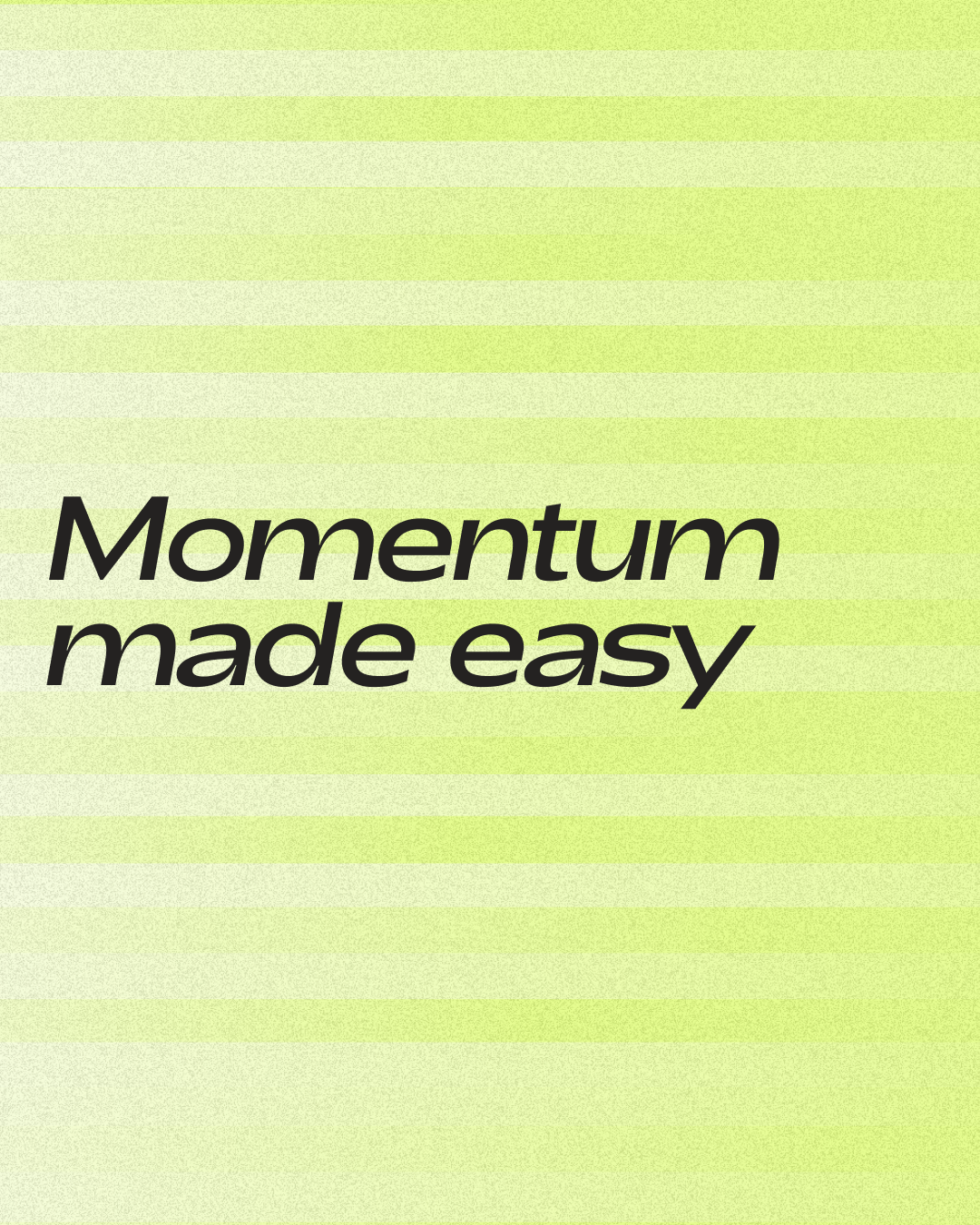
Keep the flow going
A line that captures both sides of Yoru’s value.
Practically, it helps improve cash flow.
Emotionally, it helps creative businesses protect their flow state, maintain momentum and keep making great work.
The Creative
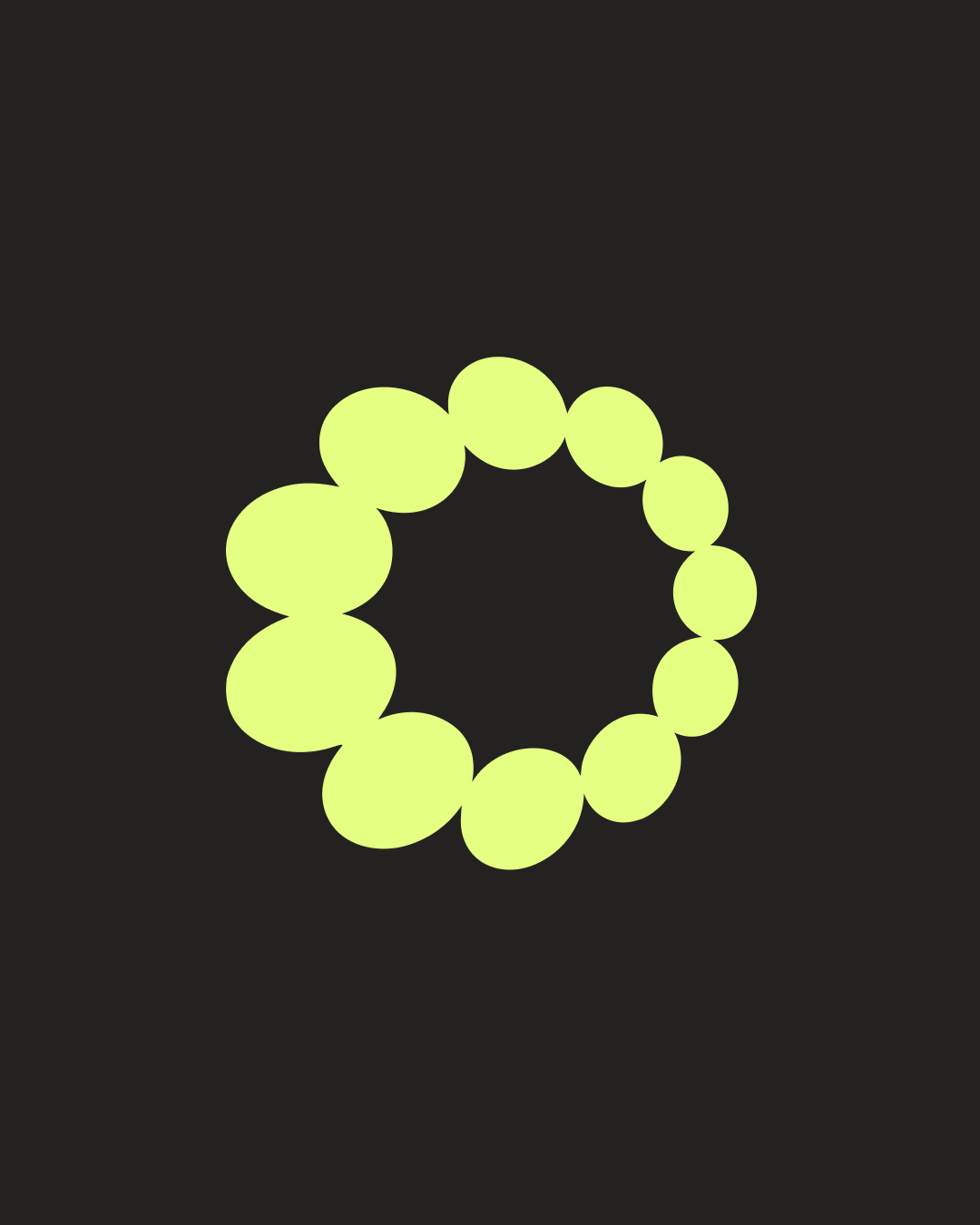
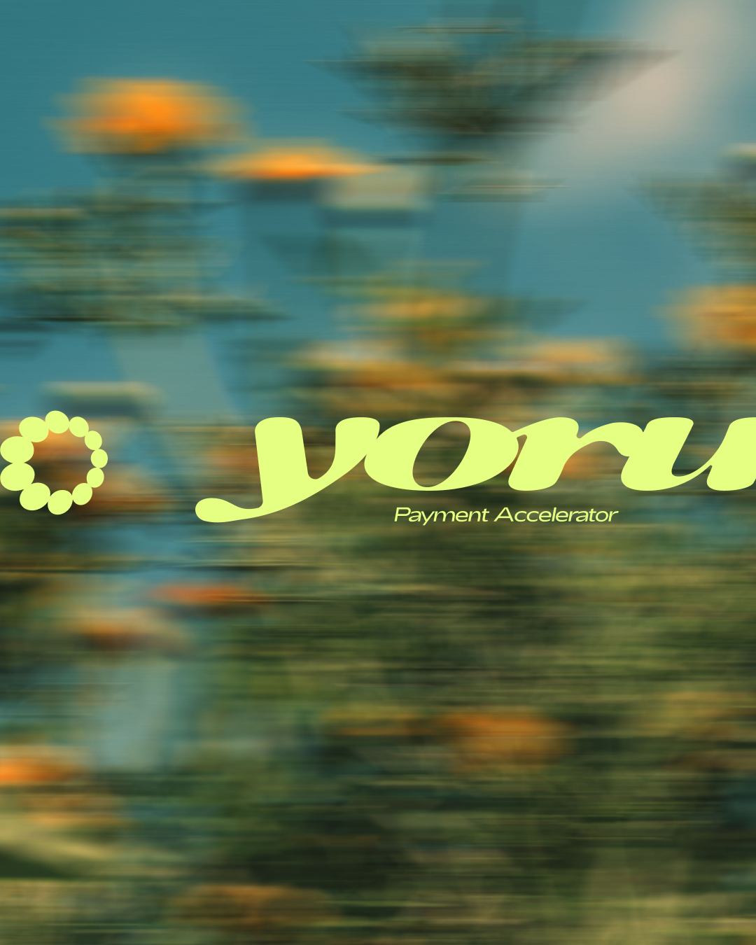
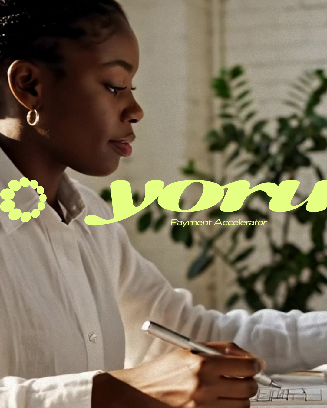
Yoru’s new identity was built around the idea of Accelerated Flow.
Developed in collaboration with Rosie Pearmain at Studio Rosa, the visual world expresses motion, momentum and creative energy. Assets feel as if they are moving forward, giving the brand a sense of pace and momentum.
The identity also plays with the feeling of time speeding up - that immersive state where a day disappears because you are fully absorbed in the work. A visual nod to the creative flow state Yoru helps protect.
A bold colour move to ‘Accelerate Green’ helped complete the shift.
In a category dominated by predictable blues and purples, the new palette creates immediate distinction while offering a fresher, more optimistic take on the colour of money.
The Result
Yoru moved from looking like another fintech startup to feeling like a brand built specifically for creative businesses.
A clearer proposition made the offer easier to grasp.
A stronger emotional idea made it more resonant.
And a more distinctive identity gave the business a brand world with far more energy, relevance and memorability.
What emerged was more than a new look.
It was a clearer story about what Yoru enables: better cash flow, better creative flow.